Thursday, January 22, 2009
Friday, January 09, 2009
Photo-Essay Plan Part 2
Thursday, January 08, 2009
Photo Essay Plan
1 - College
Types of Pictures that I could take:
Library, Reception, Classrooms etc.
2 - Online/Computer Games
Types of Pictures that I could take:
Actual Game footage (may have problems with screen...), people playing games etc
3- Plantlife in Crawley
Types of Pictures that I could take:
The types of plants they have in crawley, where they are located
Types of Pictures that I could take:
Library, Reception, Classrooms etc.
2 - Online/Computer Games
Types of Pictures that I could take:
Actual Game footage (may have problems with screen...), people playing games etc
3- Plantlife in Crawley
Types of Pictures that I could take:
The types of plants they have in crawley, where they are located
Thursday, December 11, 2008
Photography Day
 Landscape
I have chose this picture because I thought that it really met the Nature vs Urban requirements ... also the carbon dioxide from the cigarettes in that smoking area makes it Plant Paradise so ... yeah basically I picked this one from the Landscape pics because it was one of the best ones

Social Documentary
I chose this picture because I thought it really showed that it can be really busy, especially since it is getting closer to Christmas

Portrait
I chose this picture because I thought that a person next to a lift looks awesome! Also, I was tired and we were nearly finished using the camera
Thursday, November 27, 2008
Photo Montage
A photo montage is putting a lot of images together to create a new and totally different picture
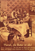
1- Hurrah, die Butter ist Alle! (In english: "Hurray, we have run out of butter")
Published in 1935
Denotations
Family, Weaponry, Steel/Metal, Hitler

1- Hurrah, die Butter ist Alle! (In english: "Hurray, we have run out of butter")
Published in 1935
Denotations
Family, Weaponry, Steel/Metal, Hitler
Connotations
- Swastikas all over the walls
- Family forced to eat metal objects (even the dog)
This photo is suggesting that Hitler and his generals are letting the German people go hungry and go to extremes because of it

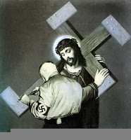
2- "The Cross was not Heavy Enough"
Denotations
Jesus, Nazi, Metal, Heavy
Connotations
- The Nazi is making Jesus suffer by making the cross heavier
- The cross is now in the shape of a swastika
It looks like the Nazis are defying Christianity
 3- "The meaning of the Hilter Salute"
Denotations
Death, Savagery
Connotaitons
- A Soldier Dead
- Arm raised to look like how people salute Hitler
- Hitler's name is dripping blood
It is suggesting that people will die if they join Hitler's cause
Thursday, November 20, 2008
Photoshop - 1st Lesson
In this lesson we looked at Photoshop and experience the different tools. We didn't get to use all of them but we did get to use some important ones
Marquee Tool
I used this tool to select an area of the picture, copy it, paste it and move it around
Text Tool
I used this tool to change the font colour and font size to make it look how I wanted it to look
Clone Stamp Tool
I used this tool to change parts of the picture such as rubbing out peices I didn't want or new things I wanted to put in
Move Tool
This tool moves a selected thing around
Lasso Tool
This tool can allow you to cut out what you want but it has to be a complete shape or it connects it by itself
Magic Wand Tool
It selects a part of an image but it will cut out other things that were the same colour as the part of the image selected, if it is attatched
Thursday, November 13, 2008
Thursday, November 06, 2008
Landscape Photography
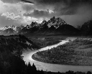
Name of Photographer: Ansel Adams
Birth Place: San Francisco, California
Year Born: He was born in 1902
Death?: He died in 1984
Names of Influencial Works:
1- A Close up of leaves in a Glaicer
2- The Tetons and the Snake River
3- McDonald Lake, Glacier Park
Explain in a Few Words the Type and Subject of Photography that this Person Produces
Most of his pictures didn't have people in them. They were usually taken in natural parks and there was usually a deep meaning to his pictures. The Snake River for example, is a beautiful image. There is a beautiful scenery in the Golden Third, jagged mountains in the background and dense forest in the foreground. The Rule of thirds is quite simple; Foreground at the bottom, Backround at the top and the Golden Third in the middle and most of the detail is found in the Golden Third. Not all photographers follow that rule. The light curves, like the river does. In Britain we read from left to right and the river sort of curves that way so it makes the picture a lot more interesting to look at
How Does this Person's Work Make You Feel?
For some reason, seeing the landscapes makes me feel relaxed, depending on the scenery. This is because it's a totally different landscape to England's (Since it rains a lot here) and different unfermilliar atmosphere makes me feel curious about the countries other landscape wonders (if there are any others that I haven't seen yet)
Does this Person's Work Influence Your Own Photography? How?
It will probably make me think about what I want in the picture. In the background, foreground and the Golden Third. In Crawley, I would have to think about light and how I could make it dramatic. Not as much as Ansel Adams, obviously. There are obviously a lot of people around Crawley all the time so it'll be difficult to get any good pictures...
Tuesday, November 04, 2008
Social Documentary
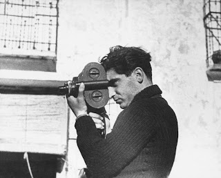
Name of Photographer: Robert Capa
Birth Place: Budapest, Austria-Hungary
Year Born: He was born in 1913
Year Died: He died in 1954, after stepping on a land mine in Vietnam
Names of Influential Works:
1- "Death of a Loyalist Soldier"
2- D-Day Landing Photos
4-
Explain in a Few Words the Type and Subject of Photography That This Person Produces
Robert Capa captured several moments during the wars his pictures were of. I think it was brave of him to actually go out in the frey and take pictures first hand
How Does This Person's Work Make You Feel?
It makes me think about the world differently and kind of reminds me of my old History Lessons ... (The Teacher was so bad -_-') So I studied by using Horrible History Books by Terry Deary and now I know stuff other people didn't know about things
Does This Person's Work Influence Your Own Photography? How?
It will probably make me think about what I want in the picture and how I want the person looking at the picture to feel about what they are seeing

Thursday, October 16, 2008
The World Turned Upside Down

I took this picture because I remembered that a lot of people don't look at the floor, unless their self-confidence has been broken time after time by small minded morons. I tend to look on the floor a lot too ... also people like to throw stuff on the floor, like chewing gum / bubble gum or wrappers

I took this picture because I like shadows ... I find them interesting. They follow you around and copy you. They're usually visable on sunny days but other sources of light cause shadows. Shadows make me think of my past sometimes. The amount of times people left me in the dark...
Tuesday, October 14, 2008
Camera Obscura
What did you see whilst you were inside the camera obscura?
We were in a room that was pitch black. Except for a small hole in the wall which was letting a tiny amount of light in. It took a while for our eyes to adjust to the lack of light but after a while, we bagan to see something on a screen. It was blurry at first but after a while, it became clearer. Eventually I saw that it was the street outside the college, but it was upside down!
How is this camera obscura similar to the inside of a camera?
The lens in the camera would of had the same effect. It captures the image and the lens turns the light from the image upside down.
How is it different?
The size is different because the hole wasn't (and isn't) adjustable. If we cut the hole bigger we wouldn't have seen the image at all and we would never get it smaller again
Why is the image upside down?
The image is upside down because a lot of light is forced to go in a certain direction which slows the light down so it projects the image. But the human eye turns the right side up image upside down
Thursday, October 02, 2008
SLR Camera Notes
1st way to control light in the camera:
Shutter Speed- the time it takes for the shutter to open and close
The slower the shutter, the more light hits the film
The faster the shutter, the less light hits the film
Small Aperture - Less light (Greater Depth of Field)
Large Aperture - More light (Lesser Depth of Field - Blurry)
Lower number - Larger Aperture
Larger number - Smaller Aperture
Shutter Speed- the time it takes for the shutter to open and close
The slower the shutter, the more light hits the film
The faster the shutter, the less light hits the film
Foreground
Background
Depth of Field (DOF)
2nd way to control light in the camera:
Small Aperture - Less light (Greater Depth of Field)
Large Aperture - More light (Lesser Depth of Field - Blurry)
Lower number - Larger Aperture
Larger number - Smaller Aperture
Notes from Last Lesson
Last lesson, we looked at an image of a painting by Renee Magritte called "The tretchery of Images". The painting is an image of a pipe and the caption underneath reads "Leci n'est pas une pipe". This is French for "This is not a pipe". This is supposed to make people think differently and that was when we began to look at Semiotics (study of images) and Representation. We looked at examples of this through images and their meanings. After that we looked at Signifier (the thing itself) and signified (the reaction to the thing) Then we looked at Denotation (to list) and Connotation (complex observations), which in my opinion was very repetative and boring (No offence, Chris)
Thursday, September 25, 2008
The Tate Modern Image I Hated
The Tate Modern Image I Liked
Subscribe to:
Comments (Atom)


